The Skylight Calendar 2: A Month Later
Okay, we’ve spent over a month now with the Skylight Calendar 2. We’ve lived with it, mounted it, and integrated it into the daily flow, and here is our experience.
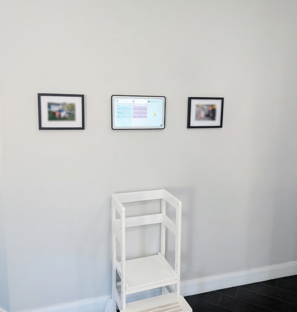
The core “why” of this device is simple: organization. Giving everyone in the house the ability to see everyone else’s schedule at a glance is, honestly, amazing. It’s one of those things where you don’t realize how much friction exists in “who is doing what and when” until that friction is just… gone. It keeps the entire team on the same page without anyone having to dig through their phones.
Design and Aesthetics
Visually, Skylight actually nailed the hardware here. The calendar layout, the color palette, and the overall UI design are genuinely pleasing to look at. It doesn’t feel like another clunky “smart home gadget” or an eye-sore tech brick sitting on your counter. It’s clean.
One small but massive quality-of-life feature: the display sleep timer. You can set the screen to turn off during specific hours, which we found extremely useful at night. These displays are vibrant, and without that feature, it’s bright enough to light up the entire room when you’re trying to catch some sleep.
The Family Experience
Beyond just dates and times, there are some “quality of life” features that actually ended up being highlights.
The Rewards System: This is a big one for kids. They can earn stars for chores and then redeem them for rewards you define—whether that’s cash, treats, or extra screen time. It gamifies the household in a way that actually works. My two kids LOVE this.
Event Countdowns: There’s a native countdown feature for things like vacations or school breaks. It’s a small software touch, but seeing the days tick down adds a layer of excitement.
Software and Syncing
Of course, none of this matters if the syncing is broken. Thankfully, the Google Calendar integration is seamless. It pulled in multiple calendars without a hitch, and it stays updated in near real-time. The mobile app also deserves a shoutout; it’s a solid companion that lets you add rewards, events, recipes, or lists on the go. You don’t have to be standing in front of the device to make changes, which is exactly how it should be.
What’s New in Version 2?
If you’re looking at the jump from the original to the V2, there’s actually a lot of “pro” level refinement here. It features swappable magnetic snap frames available in colors like Sage and Lagoon, or premium materials like aluminum and wood, so you can actually match your decor. The body is 20% slimmer with a much more modern silhouette, and the screen is a massive 60% brighter with better color accuracy. Under the hood, they’ve packed in 3x faster processing, so the UI feels snappy and responsive. They also redesigned the 180° tabletop stand to be lighter and more adjustable based on direct consumer feedback.
The “Wish List”
Now, it’s not perfect. There are two things I’d love to see in a “Calendar 3” or a Pro model:
Power over Ethernet (PoE): For the enthusiasts who want a clean, in-wall wire look, a native PoE adapter or built-in PoE would be huge. Currently, you can DIY a hack with 3rd party adapters to get the correct power, but native support would be great.
Color E-Ink: While this HD screen is great, a future version with a high-end color e-ink display would be incredible for power efficiency and that true picture frame “paper” aesthetic.